FileMaker charting has been around for nearly a decade - since version 11! The capabilities of the FileMaker charts and graphs, along with the Chart Inspector continue to grow as the Claris/FileMaker platform evolves. Yet, even with this deep history, it seems that charting doesn’t reach the top of the list of developer buzzwords - or does it?
And at the same time, Business Intelligence (BI) is a red hot topic these days and understanding business’ data in charts is vital. Next to gathering the data itself, charting and sharing that data is the most important aspect of Business Intelligence. Companies like Amazon (AWS), Tableau, and Microsoft are all pouring significant investment into products and infrastructure to support the modern-day demands of Business Intelligence. These demands and expectations have reached nearly everyone in one form or another, making it imperative that the FileMaker developer has tools at their disposal and an understanding of the significance to use them well.
For the visual learner, charts can be an effective way to understand relevant business data such as sales numbers, customer growth, financial budgets, or employee performance. In fact, in most cases, a properly constructed chart can help a user understand their FileMaker data in ways that raw numbers on a list simply can't.
Make your FileMaker data mean something
Does your FileMaker data tell a story? A number by itself may not seem to have a large voice or mean anything significant, but if you begin to connect the dots of the data, it starts to make more sense and tells a story that provides an understanding of your business’ analytics.
FileMaker charting is a bridge to understanding the language of data. It allows you to take years of overwhelming statistics on a specific topic and put it all together in a meaningful way that users can grasp and analyze quickly.
So much useful information is stored in records of data in a FileMaker solution, but if you take that a step further, charting can help users interpret daily business processes.
Raw data: the foundation
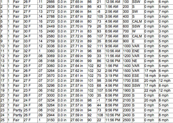
The most basic and historical way to display data is in a spreadsheet like the one below. This type of raw data is the foundation of your story (aka your report or your analysis) and you are probably used to seeing data displayed like this in your FileMaker tables, an Excel spreadsheet, or another similar program.
When you look at raw data:
- Do you immediately see the relevance of the data in the spreadsheet?
- Do you see a clear pattern and purpose or is it confusing?
- Do you feel overloaded with numbers?
- Can you determine what question is being answered?
- Does it intrigue you enough to dig deeper?

Charts: taking your FileMaker data a step further
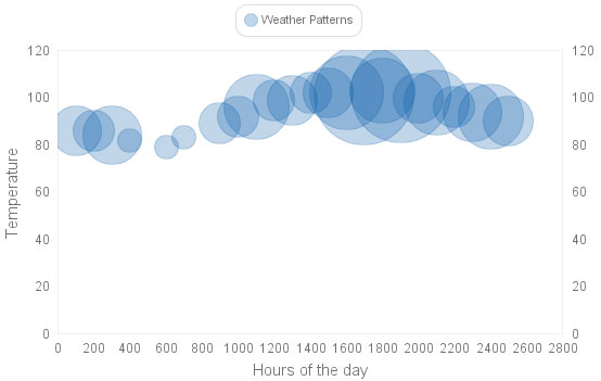
As you take the same raw data and place it into a chart, the story becomes more clear.
When you look at the chart:
- What do you immediately notice now that the data is in chart form?
- Do you see the pattern and understand the significance?
- Is the data easier to read and understand?
- Can you guess what question is being answered?
- Would you be tempted to dive deeper into the data, click around and learn more?

Charts are the master interpreter of the language of data
Charts are like the dashboard of your car, informing you of so much in an instant, good and bad. Reviewing a spreadsheet with thousands of rows and columns will take longer to understand and interpret than when you could see that same data in a chart and grasp it all a lot faster.
For example, when you build a dashboard of Key Performance Indicators (KPIs) charts in a FileMaker app, management can quickly study the KPIs and understand where their team is doing well and determine if there are any areas of concern. You are giving them the tools to effectively identify problems, create action plans, or set new goals without having to spend hours looking at fields of data on a spreadsheet.
Creating charts and asking questions - important developer skills
Chart creation should be one of the essential skills learned in your FileMaker training. Learning to transform the raw data into something anyone can interpret and understand is a fundamental tool all developers should know.
Knowing the fundamentals of the various FileMaker charts (and other options) ensures that you know when to use each type and how to structure them so that you can provide a great user experience. A line chart is one of the most primitive charts, and it is still miles ahead of no chart at all. Just think about how you can wow your users with stacked column/bar charts, pie charts, or bubble charts.
Even more important, is the ability to ask the right questions. This applies to many areas of FileMaker development, but let’s stay focused on questions related to data and charts. Often FileMaker developers work behind the scenes, writing scripts, building layouts, etc., but don’t take the opportunity to ask the users how they are using the data and what is most important to them.
It may be possible for you to create a KPI dashboard that provides charts for daily, weekly and monthly sales totals and growth, but if your user only needs the monthly sales growth totals, you may have spent a lot of extra time on irrelevant charts.
Asking the right questions early on and thinking about how your users plan to use the data/charts will keep your development time to a minimum and ensure your users are happy. Here are a few questions that can help you get on the right track:
- Who will be viewing the chart (who is the audience)?
- What part of the data do they need to know about? What is relevant?
- How often will they need the information – anytime, daily, weekly, monthly?
- Does the user know what type of chart they want to see or do you need to provide a few samples to help them decide?
How can we help with FileMaker charts?
Learning about creating effective charts may take time and experimentation, but you will quickly see the benefit. Most everyone can finish the phrase: "A picture is worth..." If that is generally believed to be true, then why not apply that principle to your custom FileMaker app?

Let us help you get started. Productive Computing University created a course called FileMaker Charting and Beyond, to show you how to create and configure 10 different FileMaker charts and demonstrate how to connect to the free version of the online charting software, Tableau.
The course also provides a FileMaker sample app to help you understand the options in the FileMaker Chart Inspector tool and view examples of each chart. We discuss best practices and provide a list of questions to ask your users/clients.
